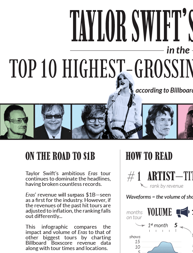
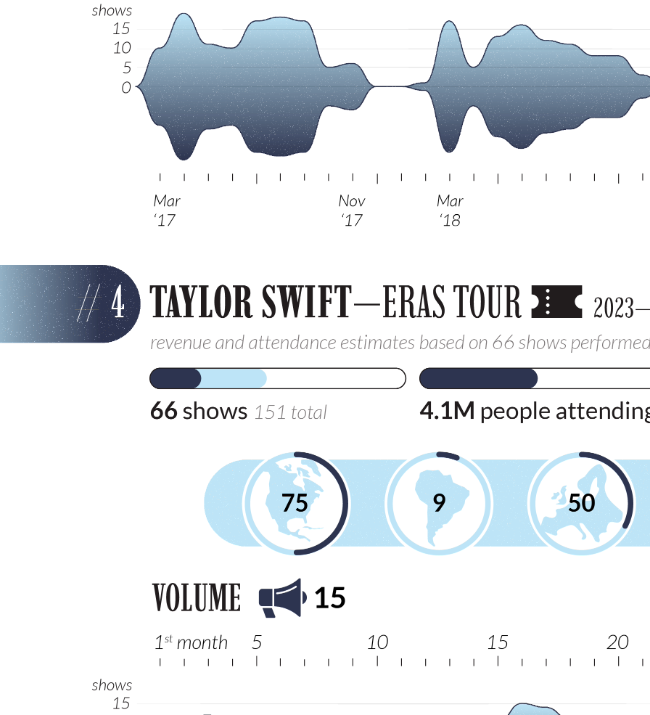
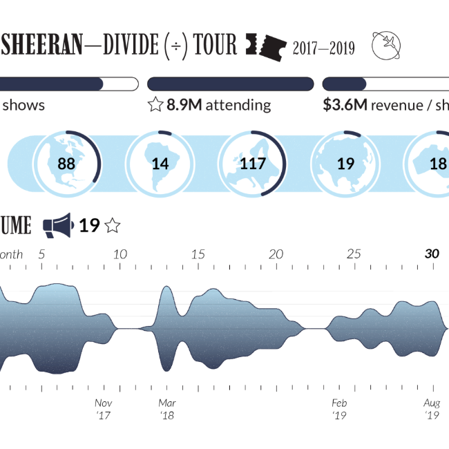
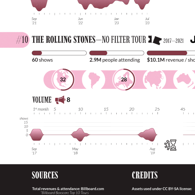
Taylor Swift’s Eras Tour—top-10 highest-grossing
About the project
An infographic placing Taylor Swift’s tour in a ranking of world’s highest-grossing tours, adjusted for inflation. Each tour’s intensity (shows per month) is shown via a topical visual fitting the musical theme, resembling waveforms. Data and estimates current as of Oct 2023.
Data sources
Billboard (unadjusted revenues and attendance),
Wikipedia (tour dates)
Tools
Adobe Illustrator


